This is a continuation of my previous post on how I created the CAFNR Edge Opening. Picking up where we left off, in Photoshop.
8. Now, with all my layers in one single image, it tends to bog down After Effects to work with so much information at one time, so I decided to break it up into sections. I saved an image with everything. Then I began deleting layers, so that I had all of the layers for Biochemistry together and then saved that as a new file. Back in my previous file with all the layers, I deleted down to having only Agriculture degrees together and saved that as a new file. I did this until I had it broken into manageable portions (click on image to view larger):
9. Next, in After Effects, I imported my first segment, Biochemistry, as a Composition. (I did this one a little differently than the rest since it moves independently first and then when the whole image pans, it scales back and moves with the rest. So, I created the circle and insides as a document, and I also have a document with that and the expansion lines/coloring that matches the scale of the whole image.)
10. One of Andrew Kramer's AE tutorials shows how to do this next technique, where I used the Write-on Effect to make each part of the drawing appear. On the first layer to appear, I drew a mask:
Then, I applied the Write-on Effect:
And copied the mask path into the brush position. It automatically applies keyframes as roving keys for each of the points on the curve, so I can move the beginning and ending keys and all the middle ones move to adjust. Then I increased the brush size, changed the hardness, and brush spacing so that it draws on very smoothly. Lastly, I set the paint style to "reveal original image". (Note: at this point, if outer edges are still not covering and I can't or don't want to increase the brush size, I would make adjustments to the mask path. Those adjustments do not automatically change in the Write-on effect, you have to copy the path and paste it in the brush position again.)
11. Next, I adjusted where the write-on begins and ends in the timeline, and began adding a mask and write-on effect to all the other layers, off-setting their start so that they don't all draw on at the same time.
I set the text (made in Illustrator) so that it matched up with the molecule elements. I also duplicated that layer, erased all letters except "CAFNR" and put spaces between so that I could take the opacity of the first layer from 100 to 0%. With all the layers of this comp finished animating, it was time to have the Biochem comp animate in the full-image comp. Because the beginning would eventually animate on via the write-on effect, keyed to match with the narrator's hand movement, it was left for later. However, the transition from Biochem to the whole image required a scale and position change, done with keyframes.
I also parented the Biochem comp to the sketch and offset the beginning movement of the sketch so that it would begin as Biochem shrinks back into the image. The expansion lines and coloring were added as another comp and also parented. Since they did not require animation, I simply lined the comp up with the sketch and made that position/scale the settings I applied to all other imported comps/PSD files. (When you import a photoshop file with layers and tell it to import as a comp instead of as footage, it appears and acts like a comp in AE, simplifying the process of importing and re-aligning each individual layer.)
12. Next, I imported the Agriculture PSD file as a comp with editable layers.
I began steps 10-11, drawing masks, applying the write-on effect, and off-setting each layer to make the drawing "paint" itself on over time. The comp was parented just like the previous, and adjusted in the main timeline, to match the music.
13. Repeat steps 10-11 for all the rest of the psd/comps.
The background comp required making a pre-comp mask for the write-on effect to appear large enough.
(This was only for the first section where the background writes-on, but the rest of it is just visible since it has already appeared.)
14. Now that everything appears via the "write-on" effect, and exists in neat little "pre-comp" sections, they all get parented to a single layer. I animated the position of that layer over time and set all in-between keyframes to "rove across time". Then, I used a comp with simplified layers (flattened in photoshop, not including the "biochem" part since it distorts too much), and dropped in my polarized image to the scene. I warped the non-polarized flattened image using the "Mesh Warp" effect over time until I had half of the little planet. Using a dissolve between the now-warped panorama and the polarized image, I made sure my animation matched between the two and what's left is the polarized image, or "CAFNR little planet". Here's an image of the mesh warp:
Friday, February 17, 2012
Monday, February 13, 2012
Timelapsed Progress of Glacial Recession - Week 3
Alas, another week gone by, fortunately my progress has continued to pick up. Once again, I've captured the dyeing and design process of Glacial Recession. This is the last week I'll be recording the work done in the dye/printing room. But, I intend to continue to record the process of layout and design.
Previous posts on this:
Glacial Recession - starting the project
Week 1 - Creative two-ways
Week 2 - Design and Dye
Previous posts on this:
Glacial Recession - starting the project
Week 1 - Creative two-ways
Week 2 - Design and Dye
Labels:
art,
dyes,
Glacial Recession,
landscape,
timelapse
Monday, February 6, 2012
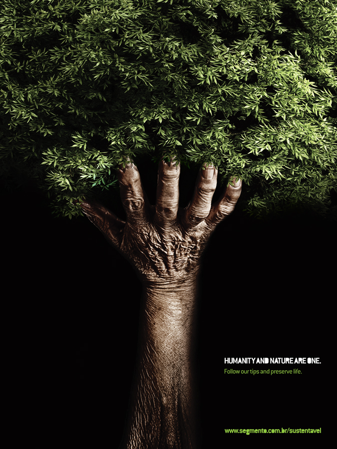
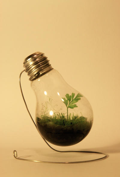
Environmentalism and Art
Found on Graphic Design Junction
Found on Graphic Design Junction
by Edina Tokodi
Found on Take Part
Thursday, February 2, 2012
Design and Dye - Week 2 of timelapsing my art
I got a lot of encouragement from a couple of fantastic people who said they really enjoyed watching my timelapse last week. So, on Saturday, after I'd decided I wouldn't be doing any more timelapses in the studio and headed out to the garage to do some spray-bottle dying, when I came back downstairs and started hanging fabric on the wall, I just couldn't stop myself. Can we say narcissistic? Anyway, most of this week was spent in the printing room, where I experimented with rolling thickened dye on, printing it on wet fabric, and using salt to attempt to get the fabrics for this piece. It's been touch and go as my frustration at trying to get a blue gray surmounted to a new decision that the sky is just not going to have gray. I really loved the texture I got from rolling the dye on, but didn't want to just do that. And the printed texture of leaves and trees are quite lovely once the actual images turn into texture rather than the specific images they started out as. Finally, I managed to control the dye/salt mixture to start getting some really interesting results.
And, I am trying out a new way of rinsing the dyes, which I found on Vicki Welsh's blog.
And, I am trying out a new way of rinsing the dyes, which I found on Vicki Welsh's blog.
Labels:
art,
dyes,
Glacial Recession,
landscape,
timelapse
Subscribe to:
Posts (Atom)


